The Helix’s first user is Dr. Michael Glantz, a social scientist who has been studying the impacts of the El Niño climate system since 1974. He runs the Consortium for Capacity Building (CCB), a research group based at the University of Colorado. The CCB is focused on influencing policy makers in areas subject to the impacts of El Niño.
Dr. Glantz quickly saw the value of the Helix as a communications tool, recognizing how it could be enormously useful in illustrating the hidden connections between large scale shifts in climate patterns and their human scale effects. Moreover, it could do so in a way that addressed three distinct challenges faced by the CCB.
The first is simply getting the attention of the right people. Because El Niño events are too irregular to predictably fall within standard electoral cycles, policy makers focused on the short-term needs of their voters tend not to see preparing for these events as major priorities.
The second is conveying the long timeframes between causes and effects. It’s natural to think of the event itself as the primary danger, with attention peaking with the primary effects of the El Niño event. However, due to the complex interplay between these events and ecosystems, the peak of the event can mark the point when real trouble is just beginning. These connections aren’t made clear by charts that focus on the climate system alone, so a more comprehensive picture of cause and effects is needed.
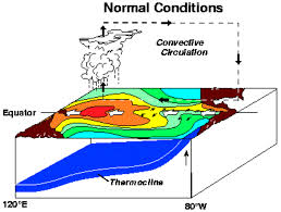
Finally, the CCB needs to connect the macro-scale of the El Nino phenomenon to the human scale, where it effects people, communities, and economies in ways that do concern policy makers. None of these challenges are addressed by climate charts like this, based on data from NOAA, which is what we started with.

Instead of relying on charts like this, Dr. Glantz wanted to use the Helix as a framework for presenting policy makers with data about El Nino and its effects. He saw the Helix as a way to convey the importance of advance planning with an appropriate sense of scale, depth, and impact—qualities that traditional 2D visualizations struggle to communicate. And by presenting this three-dimensional form in virtual reality, the CCB can secure the complete and undivided attention from policy makers whose decisions can have effects measured in billions of dollars, and millions of lives.
The first step was working with the CCB to define and distill the core points. The second was to produce a 2D visualization that can be easily circulated among funding agencies, which you can see here.
The third step will be translating this into an fully immersive interactive experience. Here, the viewer’s full sense of scale is available. By going beyond the usual means of communication – chiefly images, words, and sound – to the sense of space itself, it’s possible to get a feel for the scale and impact of these events while there’s still time to prepare for them.
In addition to dramatically strengthening the impact of the piece, this development will allow the visualization to be updated with the images, media, and data germane to a particular region (effects are felt around the Pacific Rim, and in some cases, can register in Atlantic regions).
This presentation also takes advantage of the new generation of VR displays now coming to market (e.g. the Oculus Go and the Vive Focus). Where the previous version relied on expensive PCs and cumbersome setups, these new models—known as standalones—are entirely self-contained. This solves a major logistical problem in delivering the right presentation to the right people. Given the right content, they become powerful tools of persuasion.
Categories: Banner, Lessons Learned, Preparedness


